iTunes 11 Review, Screenshots and Details
iTunes 11 has been released, so here are some of the screenshots to show you some updates and new interface of Apple's store/music player.
At first, the album view in grid mode is the same as the old version, but as you see below, the left side bar has been minimized. The tabs for Music, Movies, TV Shows, Podcasts, Books, Apps, Tones, and Home sharing has been shared in one dropdown.
iTunes 11 gives cleaner interface for the tabs of Songs, Album, Artists, Genres, Videos, Playlists, Radio and Match.
Once you clicked an album, a list of songs of that album will be shown. Aside from that, the cover art of that album will be served as background image.
As I observed, iTunes 11 can detect the side color of an album art and will choose it as background color as a whole.
Glee: The Music, Season 4, Vol. 1 has an album art color of blue-green (I think), then the background color has been changed also to blue-green.
Same with the Glee, The Music Presents: Glease, has a black side-color, then the background color has been changed also.
The Songs tab doesn't change as we can see, it's boring (just a list of songs and details)
The Artists tab is more better. There's a left side-bar for the artist, once you clicked, you will be directed to artist's album and songs.
On Genres tab, same with Artist tab; there's a sidebar, once you clicked you will be directed also to the songs/album based on the genre.
On Videos tab, no changes (I think). Same view, same player and same controls.
Playlist tab is not that boring anymore, because you can now change the view to grid, details, and artist list.
Radio is one of my favorite feature, but still no changes. The categories, stream name, and details are still there no more, no less.
More screenshots below!
 |
| Apps |
 |
| Books |
 |
| Tones |
 |
| Podcasts |
 |
| TV Shows |
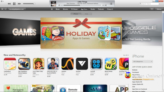
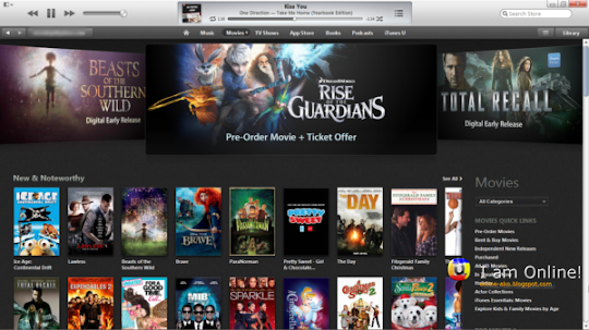
Now let's proceed to other function of iTunes, the iTunes Store where we can browse, download or buy music, apps, games, movies, books and subscriptions.
 |
| iTunes Store | Home |
 |
| iTunes Store | Apps |
 |
| iTunes Store | Books |
 |
| iTunes Store | Movies |
 |
| iTunes Store | Music |
 |
| iTunes Store | Podcasts |
 |
| iTunes Store | TV Shows |
 |
| iTunes Store | iTunes U |
MiniPlayer got a big renovation, it is now better and has many functions. You can search the entire library, look for the list of songs in album, AirPlay, controls, iTunes shortcuts, and History.
As a whole, the design is completely clean. It opens faster compared to previous version. The effects when opening/closing is now better. But there are some features that doesn't changed much.
The cover flow for iTunes 11 has gone. It now only shows grid, list, and artist view.
Overall, good and worth waiting.
Get it now here: iTunes 11 for Mac and Windows in Now available! Download it now!


Post A Comment
No comments :
Comments? Suggestions? Leave it here now!